
PCA ,or Principal Component Analysis, is defined as the following in wikipedia[1]:
A statistical procedure that uses an orthogonal transformation to convert a set of observations of possibly correlated variables into a set of values of linearly uncorrelated variables called principal components.
In other words, it is a technique that reduces an data to its most important components by removing correlated characteristics. Personally, I like to think of it as reducing an data to its “essence.”
PCA Introduction
Principal component analysis, or what I will throughout the rest of this article refer to as PCA, is considered the go-to tool in the machine learning arsenal. It has applications in computer vision, big data analysis, signal processing, speech recognition, and more. Many articles, professors, and textbooks tend to shroud the method behind a wall of text or equations. Let me tear down that shroud!
First, let’s take a look at a random gaussian distribution below (a giant blog of data points):
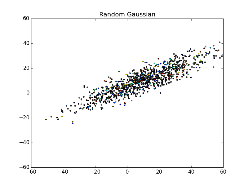 What do you see in the scatter plot?
Personally, I see a bunch of points spewed across a graph ranging from approximately (-50, -30) to about (60, 40), or from the bottom-left to the upper-right. You may even notice that the points are centered around (10,10). More or less, this is the essence of the data. We can’t really differentiate between points very easily and even though they are colored, there doesn’t seem to be any pattern.
So, where do you think the principal components of the data are?
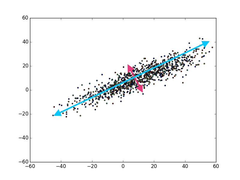 If you view the scatter plot above, I took the liberty of labeling the principal components. The first (i.e. largest) principal component being the blue arrow, and the second principal component being the magenta arrow, and that’s it! You may be wondering, “Well, what about somewhere in between the magenta and blue arrow?”
The reason there are only two note worthy principal components, is because any other component of the data in this image would have some component of the blue or magenta arrow. In other words, if we presumed there was another arrow between blue and magenta, the data in that dimension would be correlated with either blue, magenta, or both. This would be exactly what the PCA method attempts to mitigate by:
Transforming a set of observations of possibly correlated variables into a set of values of linearly uncorrelated variables.[1]
Thus, the gaussian distribution above only has two important principal components, and the PCA method should (and does) reflect that.
PCA Into The Deep
Now that you have some understanding of what PCA does, let’s dive into some of the gritty details. If you take a peek at the wikipedia article on PCA or read various other blogs/articles throughout the web, you’ll notice that there are quite a few ways to complete PCA.
To be honest, it seems like a menagerie of equations, text, and images that never really seem to get to the heart of a problem. Simply put, PCA reduces a set of data into its components by identifying and removing correlated data, this occurs by reducing the way in which data is stretched. In the example, this would be the magenta and blue arrows.
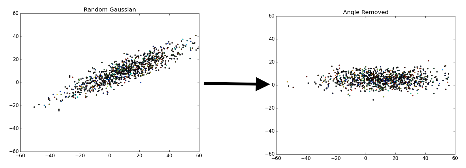
There are a fair number of ways to do this. Essentially, we are trying to separate the various components that make up the data. For example, say we have a random gaussian distribution, what we are attempting to do is remap or “move” the gaussian distribution to align with the y and x axis.
On the left we have a random gaussian distribution, i.e. random center, random direction for the axes and random “spread” (referring to the diffusion of data points). On the right we have a gaussian with the same exact “spread,” but with a center at (0, 0) and the axes have been rotated in-line with the coordinate plane (x-axis and y-axis), we will refer to this as the “centered” gaussian.
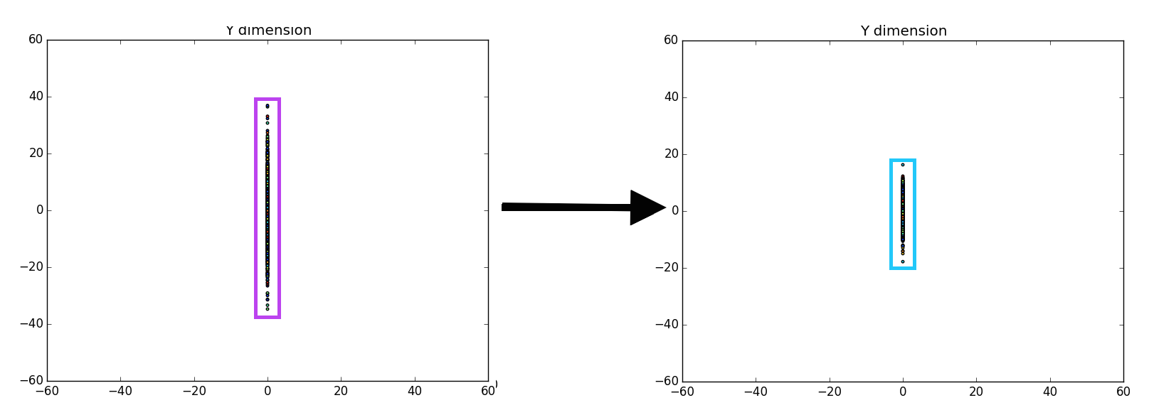
 Once we accomplish the mapping, it is easier to determine various components that we may find important. In the case above, there are only two components we have for the data, x and y. We could map or ‘drop’ all of the data points to the x-axis, since that is our first (or primary) principal component (the component which provides the most information).
 Unfortunately, it is pretty difficult to tell that there is a difference between the left entirely random gaussian, and the right centered gaussian, except for a few outliers on the dataset (which are easier to identify on the right). However, if we ‘drop’ or map all of the data points to the y-axis it becomes more clear that there is definitely a difference between the gaussians.
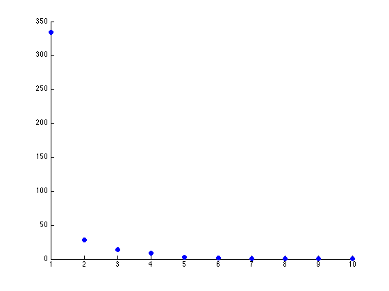
 Now, the question is, how many components would there be if we ran PCA? Below you will find the principal components graphed against each other.
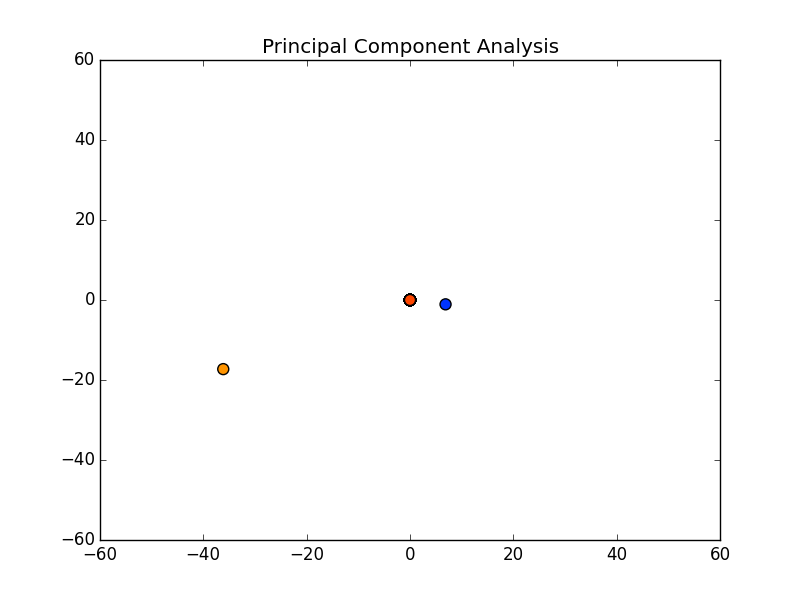 Notice there are only two points outside the origin point, that’s because those are the only components that are distinguished. The remaining points are all sitting at (0, 0)
PCA Method
Now, it is time to explain the method we can use to complete the “magic,” so to speak.
PCA makes use of the often misunderstood eigenvalues and eigenvectors[3]. For use here, I will simply describe them as a way to transform from one space to another. Oddly similar, to the way we look to map the random gaussian to the centered gaussian.
The current method of calculating PCA analysis is using SVD or Singular Value Decomposition[2], which I will not explain in detail here. SVD breaks down the data set into eigenvectors and eigenvalues, using the following equation:
dataset = X = USV*
U: left-singular vectors of X are eigenvectors of XX*
V: right-singular vectors of X are eigenvectors of X*X
S: non-zero singular values of X are the square roots of U and V
By multiplying U by S, we get the score matrix, what we will call T. The T matrix is the scatter graph from the previous section.
In the programming language matlab, creating something such as the above is ridiculously easy:
Now, if we were writing the SVD function as well that might be a bit difficult, but since we are not in this article only two lines of code are necessary. Similar functions are available in python, as well:
PCA Identifying Components
It is pretty easy to understand why and how PCA can be used to better identify/interpret data. For example, if we use the Seed Dataset from UCI Machine Learning Data Repository, we can get various aspects of three categories of seeds. By using PCA we should be able to easily identify key components. In this example, I am going to just try to identify if there is really a difference between three types of seeds (since there should be).
Let us graph the various components without PCA.
If you view the dataset, there are 7 different components (or in this case measurements of the seeds). Without using PCA we are trying to determine if there is some component that can let us predict how we should label a seed. In other words, if (for example) we see that the length of a seed is a defining characteristic of the different seeds, we need only measure a seed and we can predict whether it is a category 1, 2, or 3 seed.
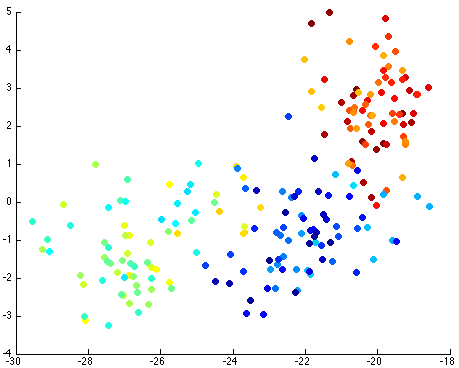
Thus, by reviewing the graph of the various components against each other, we hope to find a nice separation of the different seeds grouping separately. I took the liberty of clearly labeling each of the different seeds as blue, yellow-teal, and orange-red:
Now, if we use the PCA function (on github):
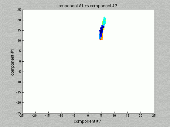
We can graph each of the components against one another (similar to the above):
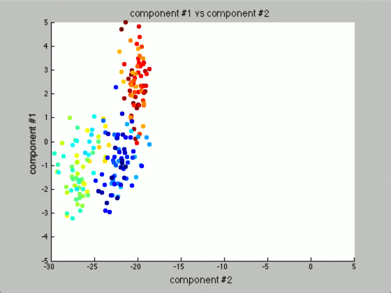
Notice that the first couple of components graphed against each other have a pretty large difference and the seeds are grouped, whereas the previous graph of components (without using PCA) leave all of the seeds in relatively the same group.
Further, only the first few components after PCA are really uncorrelated, and after the first components the seed principal components converge to zero. We can use this to our advantage (in the future), because we have reduced the dimensionality of the problem to ~3 as opposed to 7. Meaning, we found there are only 3 (useful) principal components to the seeds, everything else is pretty much the same.
This is the real power of PCA! We can make predictions based off this analysis. We can use the highest uncorrelated component(s) to classify new seeds without ever knowing the actual number of the seed. Keep reading, I’ll cover this more in the next section!
For now, let’s see how how many components we have that are of any use. Using Matlab, it is relatively easy to download the dataset, load it, and graph the principal components (on github):
The two scatterplots will look like the following, given the dataset:
There seems to be just one major component marking the clear distinction between the different seeds. Reviewing the previous graph of the PCA components graphed against each other, this seems pretty clear.
The other components we can (more or less) just toss aside, as they are not really good for identification purposes.
PCA Digit Recognition
One of the first examples for PCA is face recognition or digit recognition. By removing a fair portion of the correlated data and maintaining the uncorrelated data, it’s possible to see a clear image of the important aspects of an image.
For example, one of my homework assignments for my Machine Learning and Signal Processing course was to use PCA on various numbers.
Note, each of the images/values above represent the key features of digits. Many times the digit is even recognizable. What’s also interesting is that over time the principal components become less and less recognizable (when compared to a digit), as well as less useful in the identification.
Similar to the analysis of the gaussian above, there are only so many actual important components in identifying a digit. Relating the previous statement to the definition, there are only so many uncorrelated components.
If we wanted to take this one step further and use these components to identify digits, it is quite possible. For this example, I am going to use the PCA function in matplotlib; however, implementing an independent PCA function is quite easy (as shown previously).
In this example, I used data from the MNIST digit dataset as well as a small python function to read the data for me[4], my full code is on github.
First, we find the center of each image:
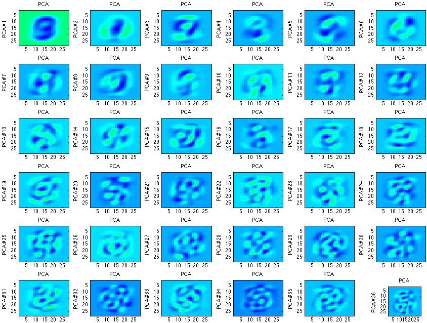
If we do this for each digit and display them, we get something such as the following:
 Which is not very clear, every digit looks roughly the same… However, if we instead display the covariance matrix of each PCA analysis, we can get a much better picture of each digit.
 If we instead create a bar graph of the key characteristics, it may make even more sense:
 Each digit clearly has slight differences. If we find the euclidian distances between these “feature” or “score” matrices (previously described as T) and an image we are trying to identify, we should be able to identify the digit.
For example, if we are given an unknown digit (as humans can clearly see is an 8), we can compare the euclidian distance between the unknown digit to each of the 10 digits we have created a score matrix for. The smallest euclidian distance will likely be the correct digit and we can then label it appropriately. This would look similar to the following:

To test my implementation, I used the following code (available on github):
The method above managed to achieve ~74% accuracy. Overall, this is nowhere near the best possible implementation (which should be able to achieve +90%). However, it did work and I felt was fairly good, and with a couple minor adjustments can achieve +90% accuracy.
Conclusion
Principal component analysis is an oldie, but a goody.
Overall, PCA can be an excellent first method to try to interpret your dataset. The method reduces data into its most uncorrelated data, which allows for the easy reduction of components, and in turn improved identification/classification.
However, one of the most important things to mention about principal component analysis is that it is by no means perfect. First, PCA is rather arbitrary and compared to many other methods is not exceptionally accurate. For example, if we decide to use something called non-negative matrix factorization, we can obtain much more accurate components (less filled with noise):
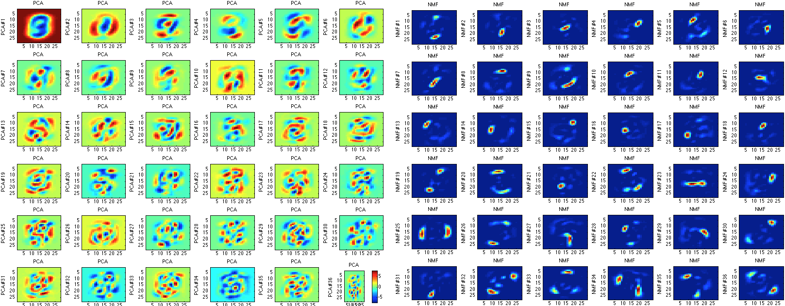
On the other hand, non-negative matrix factorization takes much longer to compute, which is a pretty large drawback when attempting to calculate a large dataset.
In general, PCA is a good first step. It is easy to implement, fast to compute, can be used with great effect, and should probably be the first method used to identify the components of the data (i.e. reduce dimensionality).
Stay tuned for updates from Synaptitude (hopefully launching a kickstarter soon)!
The PCA matlab function is somewhat difficult to read (if you are like me and never bothered to use Matlab, favoured IPython). It’s also not so obvious how stable “simple” L2 distances are under scaling between observations of digits.
Still, a nice recap on this oldie. Even Hastie’s is dry in comparison.