Recently, I switched to ProtonMail as my email provider (they enable encrypted emails) and one of the neat features of ProtonMail is that you access the CSS to setup your own theme. Obviously, I couldn’t help myself! So, I wrote a little CSS to improve my experience and provide this guide as an introduciton. I plan to continue to update the CSS as I find things I’d like to tweak. My github repo will be kept up-to-date.
ProtonMail UI
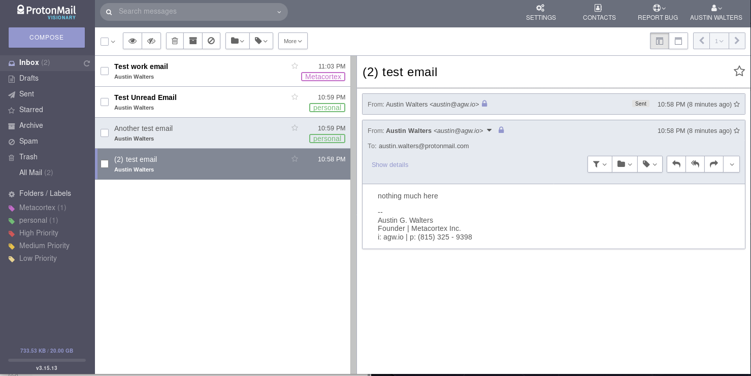
First, let’s take a look at the ProtonMail UI:
Overall, it looks similar to other email services. Nothing too special or difficult to understand.
ProtonMail UI: Inspecting Elements
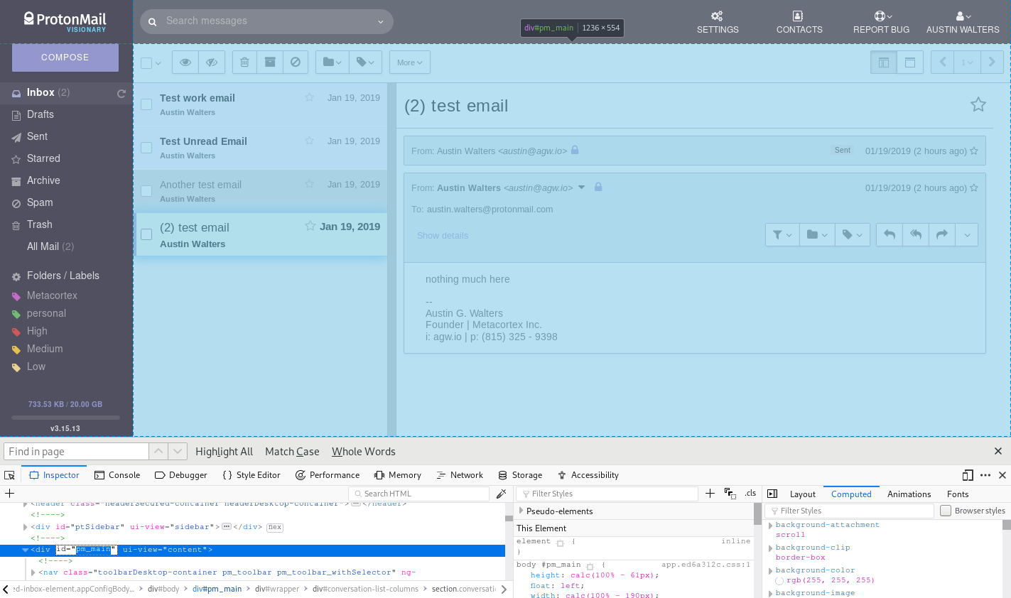
Before we get into making improvements, we first need to understand how to identify the elements we’d like to change. This is done differently on each browser, but generally done via right click -> inspect element (in FireFox):
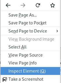 Once you inspect the elements, it’s possible to get the “id” and “class name” for each of the elements. These are the identifiers we can use to tell the elements how we’d like to see them displayed. For instance, the top level element of ProtonMail (at the time of writing), which contains the email content is called pm_main:
ProtonMail UI Improvements
Unfortunately, for me, there were two major issues with the UI:
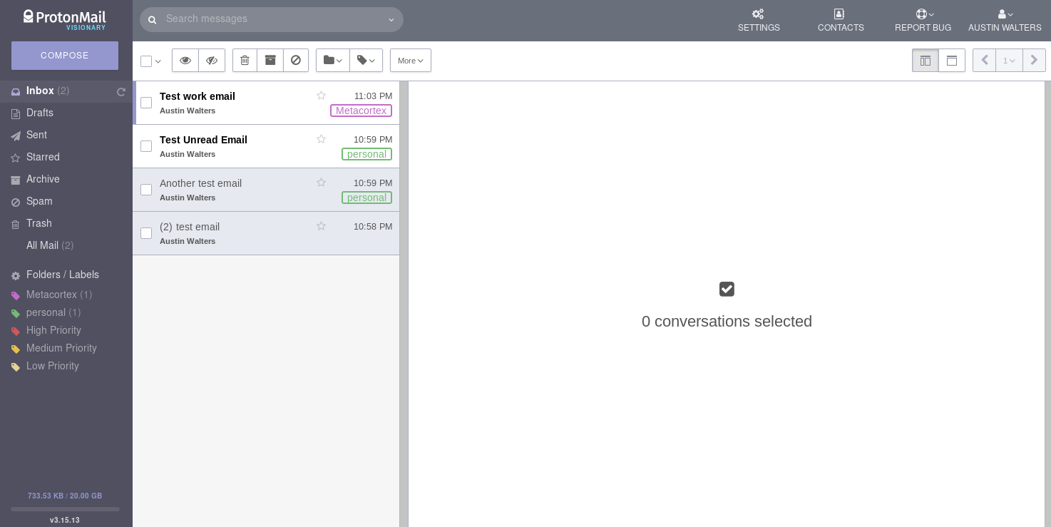
- The conversation(s) column (where you select which email chain you’re interested in) was ~40% of the screen and the conversation itself was only ~60%. I’d much prefer to see my conversation(s).
- The conversation(s) column goes dark for the selection and is only white or gray. I.e. it doesn’t stand out what I need to do. I email hundreds of emails a day, I need to know what I need to do.
Given my major issue was the conversation(s) column, I thought to myself: “This should be an easy fix”. I wasn’t wrong, it was relatively painless, so I’ll tip my hat to the ProtonMail team.
Shrinking the Conversation Column in ProtonMail
My first fix, was making that conversation(s) column smaller, something closer to 30% of the screen and making it darker (just for aesthetics):
The code to do that was really only a few lines:
I also shrunk the conversation window slightly, so the text wouldn’t line directly up with the side of my browser window. Essentially, I just set the width of each of the elements to ensure the desired viewing frame.
Highlighting Conversations in ProtonMail
The next item I needed to address was the grayness of the conversation(s) tray / column. I send & respond at time, hundreds of emails a day. Having a quick way to work through my inbox is mandatory. With that in mind, I set out building a better highlighting system. It may not be super pretty (and I’m sure I’ll update it), but it gets the job done.
First, I tackled “marking”, i.e. where your cursor or which email you have selected to open. This is very important to know if you use the keybindings. In addition, I wanted to change the “unread” emails to be more pronounced, accomplished via coloring them slightly pink and increasing the size and weight (bolding) of the text:
As you can see, the email that is currently “marked” is glowing and the “unread” emails are currently slightly pink.
The next step, was what happens if I mark multiple emails (e.g. for deletion) – I wanted just a subtle notification (along with the check):
 Looks good to me! Exactly what I was looking for.
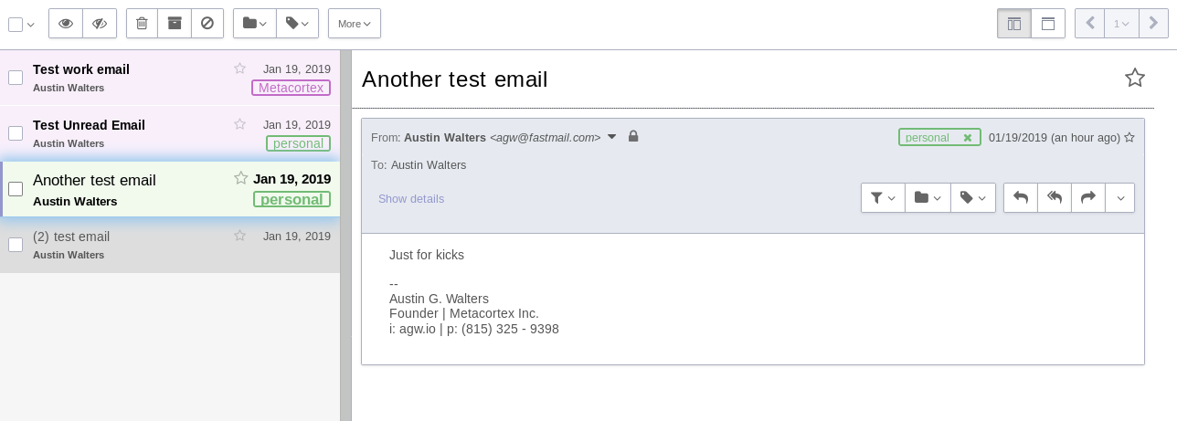
Finally, I wanted to make it abundantly clear what email I had “active” and was reading. I wanted to accomplish this in a few ways. Increase the highlighting effect I had been using. In addition, I wanted the font to be bold, large, and be a different color (light green in this case):
Beautiful! Well… At least it functions the way I’d expect it to. The code is also not too complex:
Again, if you’re interested in all the code in one file (or the most up-to-date theme) feel free to checkout my github repo. It should be as easy as copying the file out the CSS folder, and putting it into the appearance section under the settings in ProtonMail.

